Data Deliverables
Annotated Expression Table
.xlsxThe main expression profiling table for all 4 samples. Contains Gene IDs, Chromosomal coordinates, Gene Names, and Functional Descriptions.
Pairwise Fold-Changes
.xlsxCalculated pairwise Log2 Fold-Changes between all combinations of the 4 independent samples (e.g., NPFM1 vs NPFM2) to observe relative changes without statistical group testing.
FPKM Normalized Counts
.csvRaw gene counts normalized for sequencing depth and gene length using Fragments Per Kilobase of transcript per Million mapped reads (FPKM).
Visualizations
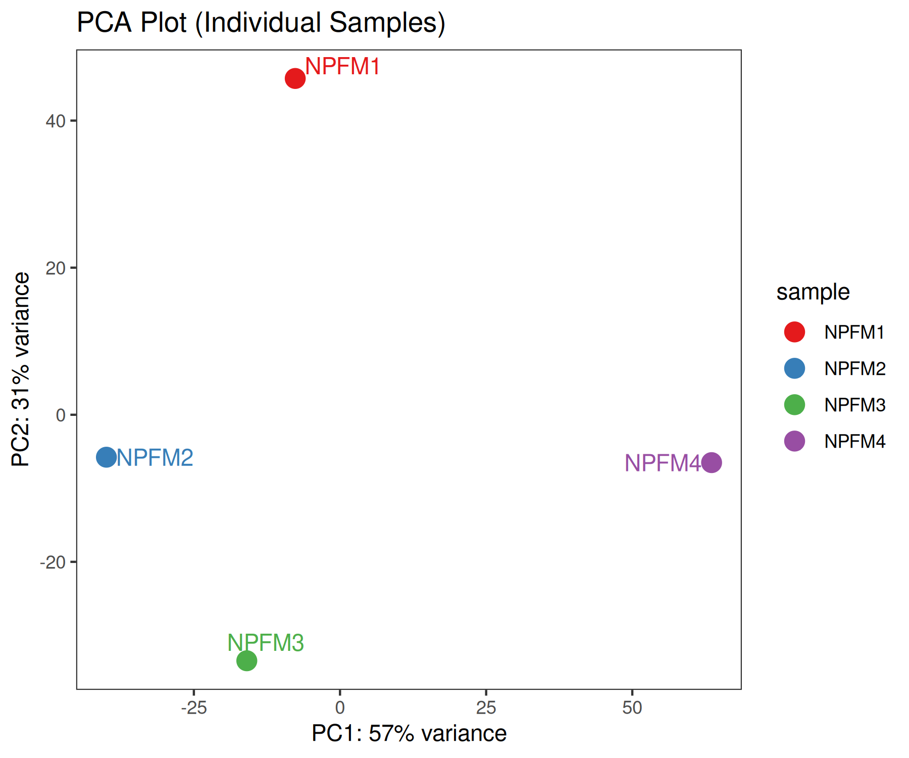
PCA Plot
Principal Component Analysis based on Variance Stabilized Transformation (rlog) of the read counts. Demonstrates how the individual samples cluster along the two axes of highest variance.
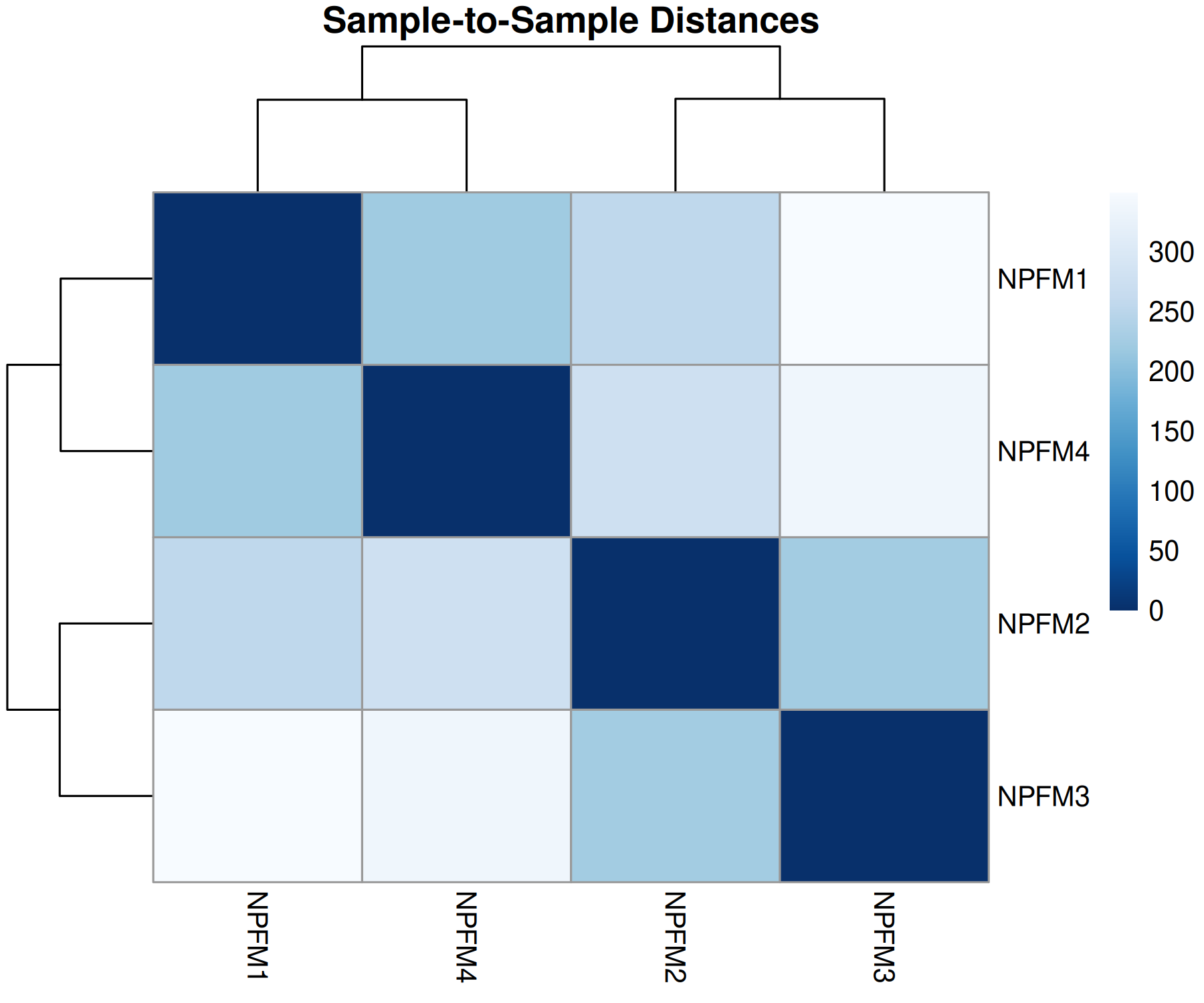
Sample Distance Matrix
Euclidean distance clustering of the 4 samples based on rlog-transformed counts. Darker colors represent greater similarity between samples.
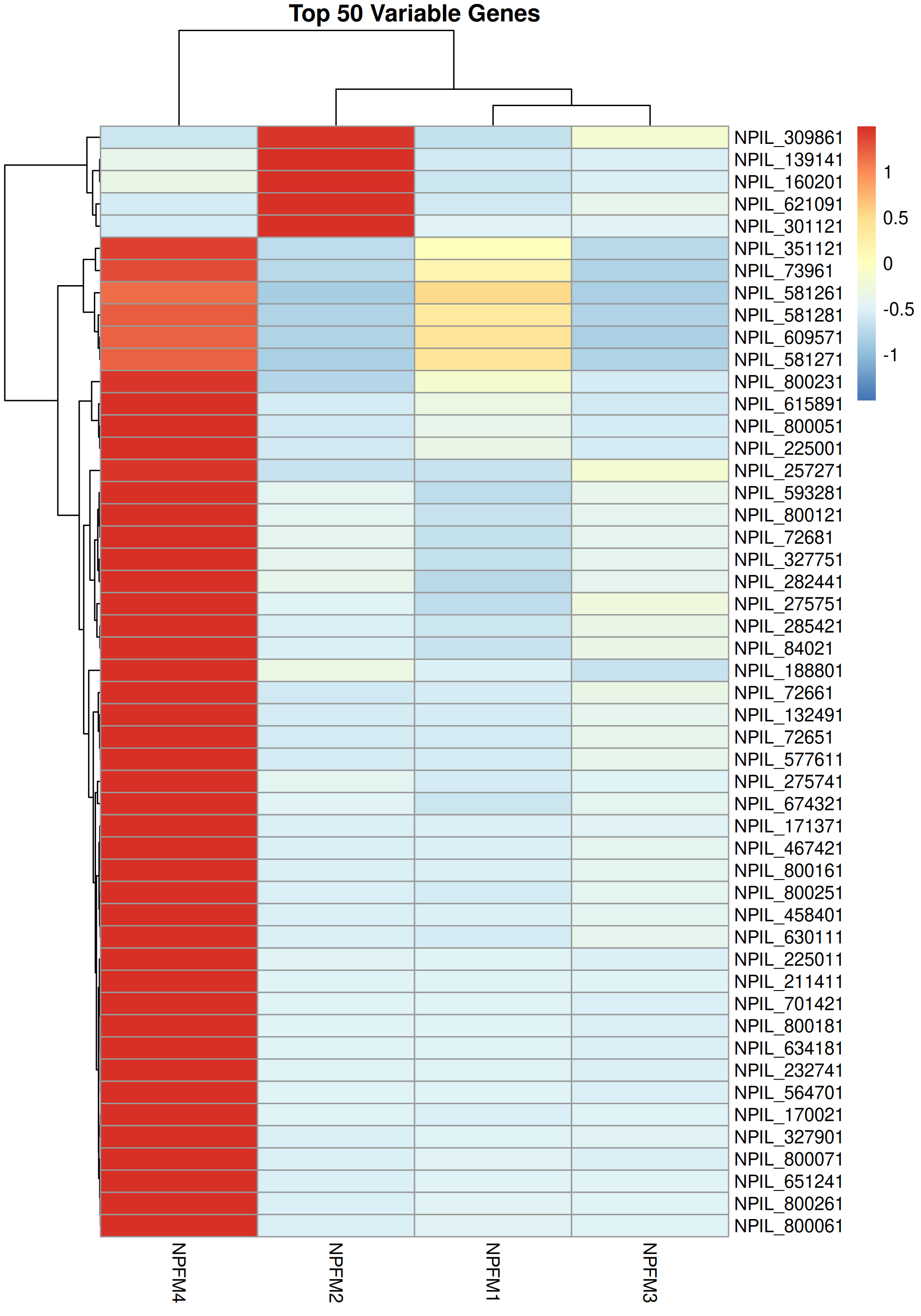
Top 50 Variable Genes
A heatmap illustrating the expression patterns of the 50 genes with the highest variance across the 4 independent samples, highlighting specific expression signatures.
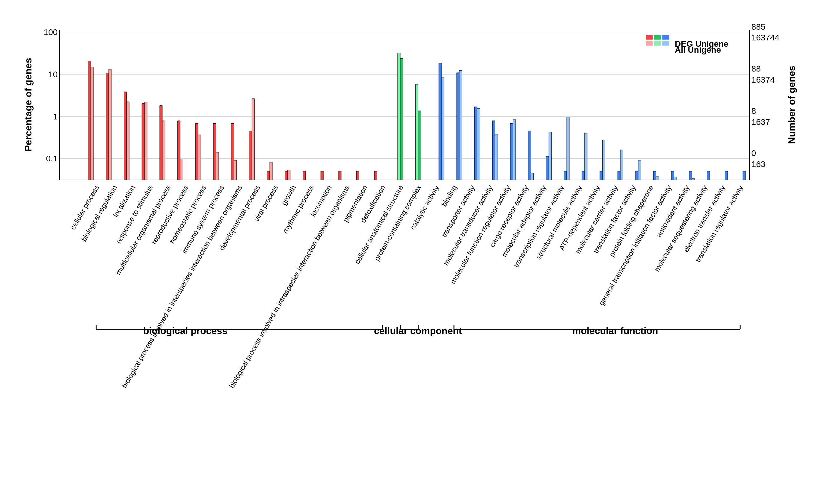
GO Classification
Gene Ontology (GO) classification bar chart, displaying the percentage and count of all unigenes versus Differentially Expressed Genes (DEGs).